


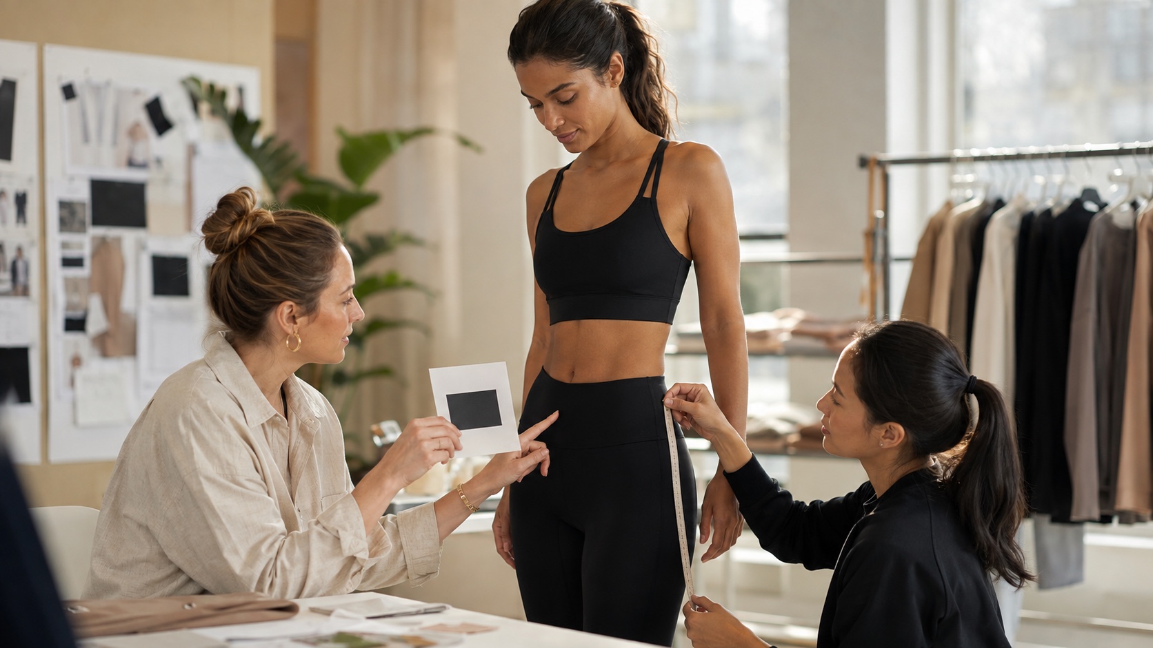
“Put our logo on the left leg” sounds like a complete instruction until a manufacturer asks: how wide, measured from which seam, in what finish, on which color, and how should it behave when the fabric stretches?
Logo decisions are small enough to postpone and visible enough to create a problem at the sample stage. A mark can be technically present and still look too heavy, sit too close to a seam, crack the visual balance of a set, or feel uncomfortable against the body.
An activewear logo placement decision is ready for sampling when the brand can explain the mark’s visual job, its reference points, and the condition in which it must remain comfortable.
Activewear logo placement should be treated as part of product development, not as a last-minute decoration request. The goal of the first branding sample is not to choose the most impressive technique in isolation. It is to approve a logo that fits the garment, the customer, and the level of product the brand is trying to build.
Start with the job the logo needs to do
Before comparing heat transfer, silicone, embroidery, or print, decide what the mark is doing on the garment. A small logo near the hem may be a quiet signature. A centered chest mark may be the main visual anchor. A back-neck mark may support a clean front without competing with the silhouette. A reflective detail may exist for visibility during a specific use case.
These are different jobs. They should not share the same size, contrast, or application method simply because the artwork file is the same.
Write a one-line branding brief:
“The logo should be visible in a product photo, quiet enough for a clean studio set, and comfortable when the wearer bends forward.”
That sentence is more useful than “make it premium.” It gives the manufacturer a visual priority, a marketing context, and a movement condition to consider.
Quick decision: if the logo is meant to be noticed from a distance, solve visibility first. If it is meant to feel like a signature, solve proportion and placement first. Do not ask one small mark to perform both jobs without testing it.
Choose the placement zone before the decoration method
Look at the garment in its natural use position. Chest, back neck, waistband, outer leg, hem, and sleeve all offer different visual and physical conditions. A logo placed near a seam may look aligned when the garment is flat and shift when worn. A mark on a high-stretch waistband may distort more than the same mark on a stable cover layer.
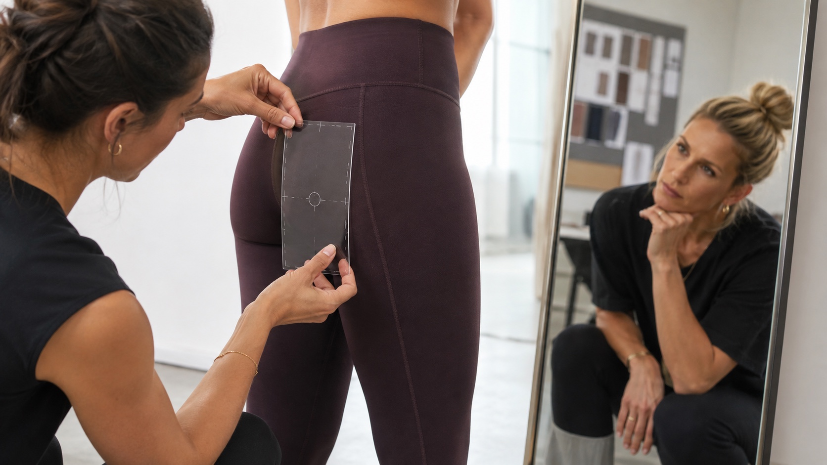
Use two stable reference points to describe the location. “Left leg” is a direction. “60 mm wide, measured from the wearer’s left side seam and positioned a defined distance below the waistband seam” is an instruction that can be checked. The exact measurement must suit the garment and size; the important habit is to stop relying on eyesight alone.
Take a front and back photo of the garment on a person, then mark the intended logo box over the image. Add a flat garment view if the body curve changes the appearance. The purpose is not to create a beautiful presentation board. It is to prevent the logo from being approved in a place that only works on a screen.
Three placement questions worth answering
- Does the logo remain balanced when the wearer stands, bends, and sits?
- Is it clear of seams, pockets, elastic joins, and areas that rub?
- Will the same visual rule work across the size range, or does the placement need a size-specific adjustment?
A small brand does not need a complex placement library on day one. It does need one approved reference for each style so the next sample and later production are not guided by memory.
Match the method to the garment, not to a trend
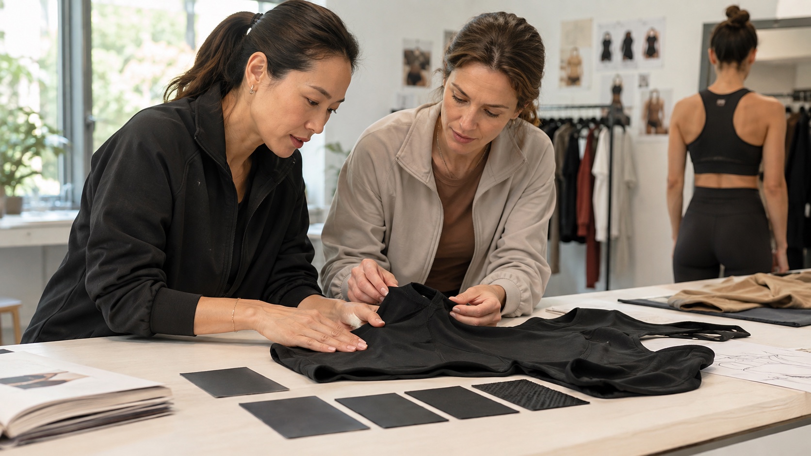
Common activewear branding methods include heat transfer, screen or placement print, silicone-style applications, embroidery, woven labels, and printed internal labels. Their suitability depends on the garment surface, stretch, logo detail, desired hand feel, placement, color, quantity, and project conditions. Industry manufacturing guidance also emphasizes that the artwork, method, dimensions, and distance from seams need to be defined before sampling; Motioncend’s activewear printing overview gives a useful example of the information manufacturers typically need.
Keep the comparison practical:
| Method | Usually useful when | Questions to confirm on the garment |
|---|---|---|
| Heat transfer | You want a clean, light mark with fine details on a suitable surface | Does it stretch with the fabric? Does the edge stay flat? Does the finish feel comfortable? |
| Screen or placement print | The design suits a surface print and the area is stable enough for the intended result | Does the color remain clear on the chosen garment color? Does the print feel too heavy or crack when stretched? |
| Silicone-style application | You want a raised or tactile mark and the placement can support it | Does the added surface feel comfortable? Does the mark distort in movement? |
| Embroidery | The area is stable and a textured stitched mark suits the product | Does the stitching pucker, add unwanted stiffness, or sit poorly on a high-stretch panel? |
| Woven or printed label | The brand information belongs inside the garment or on a hangtag rather than on the outer surface | Is the label soft enough, correctly sized, and carrying the information required for the destination market? |
This is a selection guide, not a guarantee. The same method can behave differently on different fabrics and constructions. Approve the finish on the actual garment or a relevant placement sample, not from a supplier’s catalog photograph.
Do not approve the logo while the garment is flat
A logo may look centered on a table and move upward when the waistband stretches around a body. A small chest mark may become visually large when the fabric pulls. An inside label may feel harmless in a product photo and irritating after ten minutes of wear.
Check the logo in four states:
- Flat: confirm the artwork, color, size, and position.
- Standing: assess the visual balance on the intended garment size.
- Moving: bend, reach, squat, walk, or perform the product’s actual activity.
- After ordinary handling: inspect whether the mark lifts, puckers, scratches, or changes the garment’s feel.
You do not need to claim a fixed wash-life or performance result from one sample. You do need to identify what must be confirmed before approval. If the logo will be marketed as highly durable, define the relevant care and wear expectation with the manufacturer rather than treating a visual check as proof.
A useful sample comment sounds like this: “The logo position is balanced standing, but the lower edge folds into the waistband during a forward bend. Please review the vertical position or size and show the next version in the same movement.” It names the condition and leaves room for the appropriate construction decision.
Use an activewear logo placement card instead of scattered messages
For each outer or inner branding element, record these fields:
- style name and garment colorway;
- artwork file name and revision;
- logo method and color or finish;
- finished width and height;
- placement reference measured from stable seams or garment points;
- front, back, left, right, or wearer-side orientation;
- the sample or placement proof that must be approved;
- the movement, comfort, or care question that remains open.
“Small white logo on left leg” is not a production standard. A reference photo can support the instruction, but it should not replace the artwork file, dimensions, and placement rule. Keep the approved image with the latest sample notes so the next revision does not quietly revert to an earlier version.
For labels, separate brand preference from legal responsibility. In the United States, the Federal Trade Commission explains apparel labeling requirements, and its Care Labeling Rule covers care instructions. Other markets may have different requirements. Confirm the destination-market rules and the final information with the appropriate party; do not copy a label from another brand and assume it is compliant.
When a logo decision changes the development route
If the garment is an existing silhouette with available colors, predefined sizes, and confirmed branding options, Battlerobe’s Ready-to-Custom route may fit the project. The route can support branding choices such as a logo, hangtag, logo packaging bag, or courier bag, but it does not include a custom fabric, custom color, custom cut, pattern, or custom fit. The current public information states a minimum of 20 pieces per design and a minimum order of 100 pieces; sizes and available colors may be mixed, and current project details should still be confirmed.
If the logo must move because the pattern, seam, waistband, fabric, or cut is changing, it is no longer just a decoration request. A Custom Development route may be the relevant conversation because the brand is developing the garment and the branding together. Send the artwork, the placement card, the reference images or sample, the details to keep, and the details to change. Feasibility, material options, MOQ, price, and timing remain project-specific confirmations.
This is where a manufacturing partner should be useful: not by choosing a logo for you, but by helping turn a preference into a sample that can be seen, worn, and judged. The final decision still belongs to the brand.
A simple approval test for your first branded sample
Before approving the logo, answer yes or no to each question:
- Can another person place the logo from the written instruction without guessing?
- Does the size support the intended visual job of the mark?
- Does the method suit the garment’s surface and stretch area?
- Does the logo remain balanced in the intended movement?
- Does it feel comfortable where the wearer can touch or rub it?
- Are the artwork revision and colorway clearly recorded?
- Have label and care details been separated from outer-logo preferences?
- Has the approved result been attached to the current sample record?
If you answer “no” to the first four, do not solve the problem by ordering more branded units. Clarify the instruction or request a focused placement sample. If the garment itself is still changing, wait until the relevant seam and stretch conditions are stable enough to judge.
The best logo is not the one with the most complicated application. It is the one that looks intentional on the body, feels right in use, and can be reproduced from a clear approval record. Make that standard visible before sampling, and a small brand detail becomes an asset instead of another source of revision.


